It’s taken over a year and a half, but Google’s mobile-first indexing is finally here.
The Search Console messages have begun to appear, and sites are steadily being switched over to the mobile-first indexing approach.
A lot has been written about mobile-first indexing, but most of the attention has focused on the basic aspects of mobile search engine optimization. In this article, I want to dig into some of the more technical aspects of mobile search engine optimization (SEO) and show what you can do to ensure your website is fully ready and will survive the mobile-first indexing era.
Mobile-first indexing
What does Google mean by “mobile-first indexing?”Contrary to what some SEOs believe, Google is not creating a separate index for mobile search. Whether a site is part of the mobile-first indexing approach or not, Google still serves its search results from the same index of the web.
At its core, only one thing really changes: Instead of crawling websites with a desktop user-agent, Google will crawl websites with a mobile user-agent.
Historically, Google has crawled websites from a desktop perspective, with a user-agent string that indicates a desktop device:
Mozilla/5.0 (compatible; Googlebot/2.1; +http://www.google.com/bot.html)
With mobile-first indexing, this changes to a user-agent indicating a mobile device:
Mozilla/5.0 (Linux; Android 6.0.1; Nexus 5X Build/MMB29P) AppleWebKit/537.36 (KHTML, like Gecko) Chrome/41.0.2272.96 Mobile Safari/537.36 (compatible; Googlebot/2.1; +http://www.google.com/bot.html)
This user-agent string shows that it’s purporting to be an Android device, so it expects to see your website’s content optimized for mobile viewing on that type of device.
Delivering mobile-optimized experiences
With this mobile user-agent, what Googlebot sees depends on how your website is configured to handle mobile users. Delivering mobile-optimized experiences tends to happen in one of three ways:
- Responsive design. With this approach, nothing really changes. Your website’s uniform resource locators (URLs) remain the same, and the HyperText Markup Language (HTML) code served is identical as well. The site’s design will adapt to the size of the screen it’s being shown on, delivering a mobile experience catered to the device’s specific screen resolution. Google recommends responsive design as its preferred design pattern, as it requires the least effort from their end; there is no extra code to index and no additional URLs to crawl.
- Dynamic serving. Sometimes websites will detect the user-agent when a page is being loaded and serve different HTML code on the same URL depending on the type of device that’s being used. This is called dynamic serving. It is the same URL, different HTML code, one for desktop users and another for mobile users.
- Separate mobile URL. In this approach, a website will serve different code to mobile users as well and will also use different URLs for its mobile site. Often a website will serve its mobile content from a separate subdomain, like m.website.com, or from a different subfolder like www.website.com/mobile/.
Each of these mobile design approaches has its own strengths and weaknesses. For the purpose of SEO, responsive design tends to present the least hassle, whereas dynamic serving and separate mobile URLs can cause a lot of problems with your site’s SEO.
But having a fully responsive site doesn’t mean your work is done. Even if you have a responsive site and get a green mark on Google’s Mobile-Friendly Test, that doesn’t mean you don’t have anything to fear from mobile-first indexing.

There are still some aspects of technical SEO and general optimization you need to be aware of and, if necessary, fix on your site. And if your site relies on dynamic serving or separate mobile URLs, there might be quite a lot of work to be done to ensure your site continues to perform.
On-page SEO
First of all, you will need to check your on-page SEO is in order on your mobile site. For websites using responsive design, this is not really an issue, as mobile and desktop pages are basically the same.
However, if your site uses dynamic serving or separate mobile URLs, it’s important to double-check your on-page SEO:
- Do you have optimized title tags and meta descriptions?
- Do your pages have strong headlines?
- Is your content the same as on your desktop versions?
This first step is crucial. Once your site is switched to mobile-first indexing, Google will use what it sees on your mobile site for indexing and ranking. If your mobile site doesn’t have the same level of on-page SEO as your desktop site, you can expect to see your site suffer as a result.
Structured data
In addition to the basic on-page SEO elements, you will also need to keep structured data in mind. Your site may have structured data embedded on your desktop pages that can drive rich snippets in Google’s search results pages. If this structured data is absent on your mobile site, you could lose those rich snippets and the click-through rate (CTR) benefits they convey.
Make sure any structured data markup that’s present on your desktop site is also present — and fully valid — on your mobile site. Use Google’s structured data testing tool to verify your markup, and keep an eye on the structured data report in Google Search Console for potential errors and warnings.
Hreflang tags
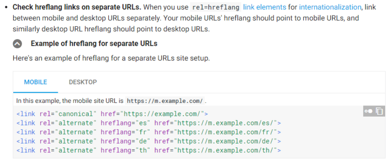
If you have an international website, you may be using hreflang tags to indicate alternate versions of your content for different countries and languages. If this is the case, you may need to update your hreflang tags on the mobile version of your site.
Google has indicated that it expects to see appropriate hreflang references on your desktop and mobile websites. So if you have a website that uses separate mobile URLs, make sure your hreflang tags on mobile point to the mobile versions of your international content:
Pagination
Sometimes, for the sake of a smooth mobile user experience, websites will not paginate content the same way for mobile users as it does for desktop users. Instead of links to deeper pages, your mobile site may use infinite scrolling for mobile users or do without any pagination at all and just show a limited set of content.
If this is the case, you will need to fix this before your site is switched to mobile-first indexing. A lack of pagination, or the wrong implementation, could mean that Googlebot won’t see beyond the first page of paginated content. If Googlebot can’t see it, it can’t be crawled and could eventually drop out of Google’s index entirely.
So make sure your pagination is properly handled on mobile, with fully crawlable pagination URLs.
Additionally, your site may use pagination meta tags to indicate paginated content. With rel=prev and rel=next, you can signpost paginated content, like lists of products or an article spread out over multiple pages.
When you use dynamic serving or separate mobile URLs, you need to make sure your pagination meta tags are in place on mobile as well as on desktop.
Internal link structure
When Googlebot crawls a website, it basically just looks for links to follow and crawl. Links are how people navigate the web, and it’s also how search engines crawl the web.
We know links are crucial for ranking purposes. Google still uses PageRank to help evaluate web pages for ranking and links are how PageRank flows through the web.
This won’t change with mobile-first indexing. Links will still be immensely important, and that means you need to look at your mobile site’s internal link structure in the same way as on a desktop.
Often mobile versions of a site will show fewer links to manage their users’ experience more tightly. Mobile devices have smaller screens and use a different interaction model (touch screen vs. mouse and keyboard), so there’s less room for links to deeper pages. The downside is that it could impact your site’s mobile SEO.
Because links are crucial for Google, fewer links on your mobile site means a different distribution of PageRank through your site. This could mean some of your deeper pages lose ranking power once your site is switched to mobile-first indexing.
A good way to check your site’s internal link structure on desktop and mobile is to use a tool like Sitebulb to crawl your site.
Configure Sitebulb to crawl your site with a desktop user-agent, and then crawl your site again with a mobile user-agent. Then, compare crawl maps for both versions and see how they differ.

Alternatively, you can use a cloud crawler like DeepCrawl to do the same.

Rather than a visual crawl map, DeepCrawl uses an internal link metric called DeepRank to indicate the internal link value for each URL on your site. By comparing the DeepRank scores for your desktop and mobile URLs, you can see how the flow of link value on your mobile site differs from your desktop site.
You may discover that some deeper pages get much less link value on mobile, and you’ll need to address this with improved internal linking.
Reasonable surfer approach
An additional aspect of internal linking is the value of each link, as determined by its place within your content.
In 2004, Google filed a patent describing a “reasonable surfer” approach to evaluating the weight a link should carry. In a nutshell, if a link is likely to be clicked on by a regular user (the “reasonable surfer”), that link should carry more weight than a link that is not likely to be clicked on.
So the position of a link in your content matters a lot. Links that are not likely to be clicked, such as footer links, will have less value than links that users are likely to click on, such as links in the main body content.
There’s no reason to believe Google will stop applying this logic in mobile-first indexing. And this could have a profound impact on your website’s internal link value, especially if your site uses mobile user experience (UX) tricks such as collapsed content and hidden divs.
Make sure you evaluate not just the presence of internal links, but also where those links exist on your mobile site. Are they prominent and very clickable, or hidden and unlikely to be clicked by a mobile user? If the latter is the case, expect those links to carry less weight than they might on a desktop.
Site configuration
Lastly, there are some aspects of your site’s technical configuration that can impact your organic performance in mobile-first indexing. These areas of your site are often neglected on mobile because they apply primarily to search engines and have little to no impact on users.
It pays to double-check each of these aspects on your mobile sites to ensure you offer a complete experience to search engines as well.
Robots.txt
Your site’s robots.txt file contains directives for search engines to adhere to when they crawl your site. If you have a separate mobile site that lives on a different subdomain, like m.website.com, you could have a different robots.txt file for that mobile site — or worse, have no robots.txt file at all.
Make sure that your mobile site has the same robots.txt rules as your desktop site, serving the same purpose. So if you are using disallow rules in robots.txt to prevent your site’s internal search function from being crawled on your desktop site, you need to do the same on your mobile site.
Redirects
Often a site will have many redirects in place to send users, and search engines, to the correct pages when content is changed or replaced. Your redirects may be optimally tuned on your desktop site, but are they also in place on your mobile site?
A lack of proper redirects on your mobile site could cause all kinds of SEO problems, so make sure your redirects are in place for mobile users as well.
Crawl rate
When your site is switched over to mobile-first indexing, there is a chance Google will increase the rate at which it crawls your site to ensure it’s finding all your mobile pages. Your site needs to be able to handle this properly without slowing your site down.
Making sure your site’s hosting environment has enough capacity to handle an increased crawl rate isn’t just for SEO; it could also speed up your site in general, which has all kinds of additional benefits.
Double-check everything, then check again
Mobile first indexing is a matter of when, not if. It will happen to your site sooner or later, and you need to be ready for it.
Preparing for the mobile-first indexing era means you need to check everything, and then check it again. Don’t be complacent; a positive Mobile-Friendly Test is just the beginning. Make sure every aspect of your site’s SEO is in order on mobile as well as a desktop, and your switch should be easy and hassle-free.
____
by Barry Adams
Source: searchengineland.com


