You know what really sucks?
Building a website, putting up a landing page and fighting to get as much traffic as possible to that landing page only to rush to your analytics to see — nothing. A lonely space on a graph where your conversions are supposed to register.
Even if you took the easy road and used one of my gazellish.com video courses to help build your pages in WordPress, conversions are what really matter. When you can’t move the needle, it’s a discouraging sight.
Your next thought might be along these lines: “What went wrong? Was it the button color? I definitely should change the button color.” You then waste your time making the most meaningless changes possible.
Optimizing conversions can be a big, hairy mess. It’s art and a science, and you might feel at times as if you need a Ph.D. to make sense of it. In truth, you just need a checklist — a roster of landing-page essentials to guide you to conversion-rate bliss.
1. Write killer headlines.
On average, 8 out of 10 people will read headline copy, but only 2 out of 10 will read the rest. You need a main headline that grabs the reader’s attention and sums up your proposition. It should be as concise as possible.
Then, craft a subhead to expand on the headline’s promise. Remember: People scan and skim. You must ensure they’ll get the gist of your pitch within a matter of seconds. These great examples of headlines and subheads do just that.
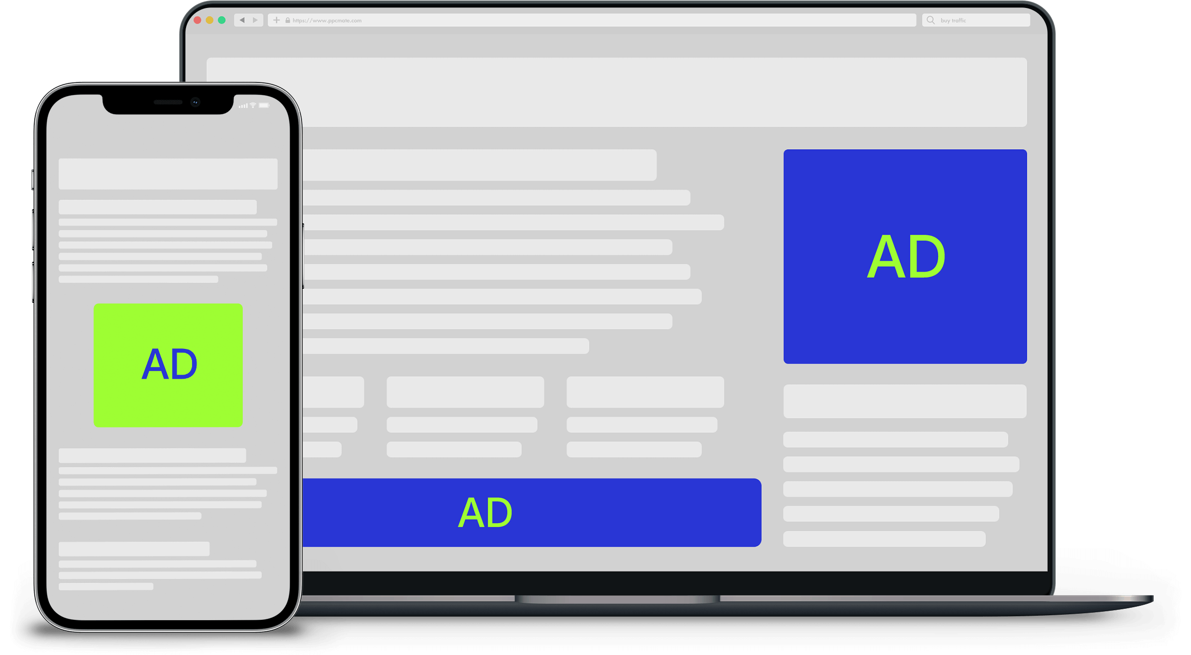
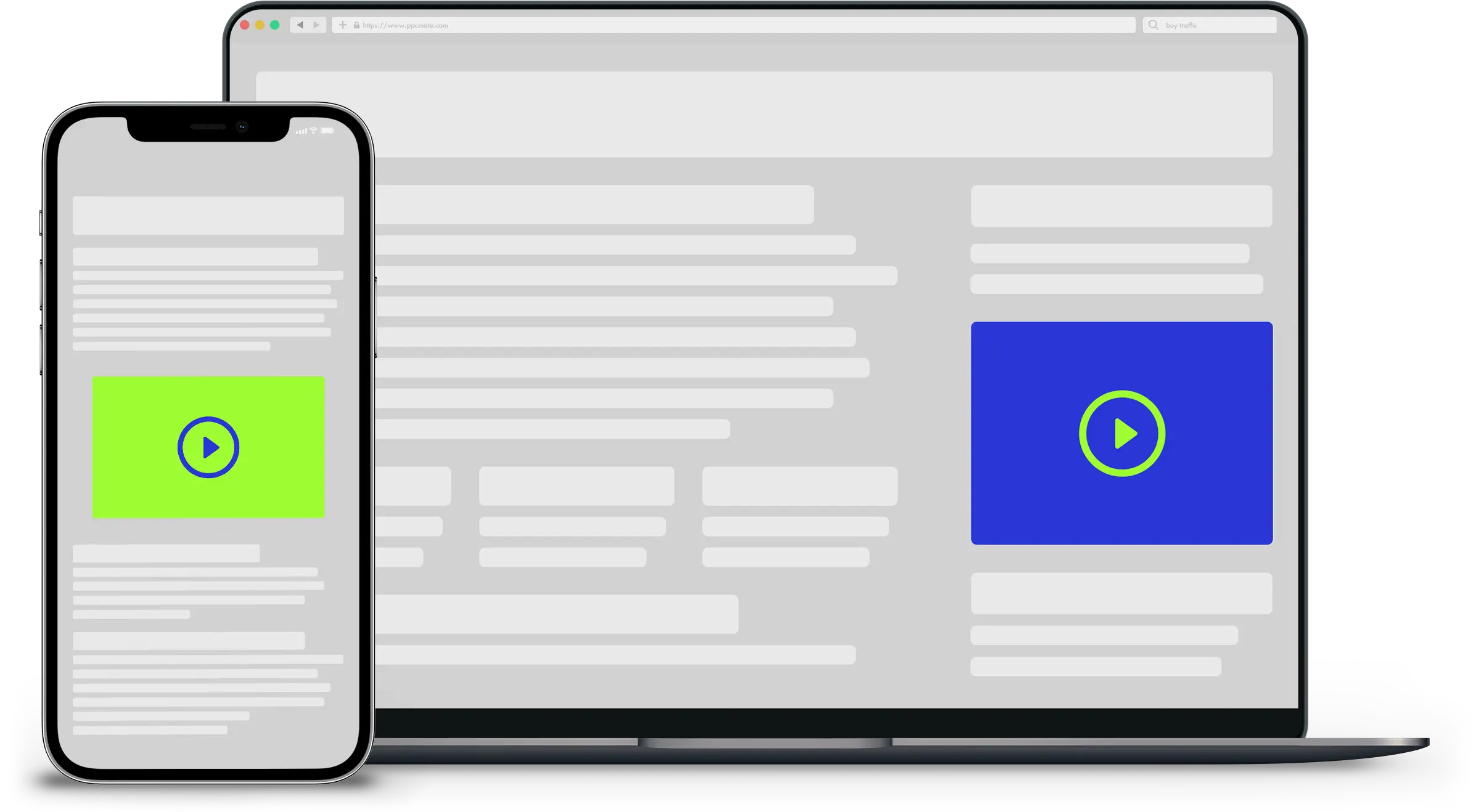
2. Include images and videos.
You usually want a good “hero image” or video above the fold. That’s old-school newspaper lingo, but it applies to virtual pages, too. Images help draw in readers, and compelling images will entice them to scroll down through your content.
Your hero image should connect directly to what you’re selling. If you’re pitching a product, it should be in the photo or graphic. If you’re selling something less tangible, such as a service, select a visual that shows someone enjoying the benefits of what you provide.
Tie your headline to your image, and you’ll have a winning combo.
3. List the benefits.
People love benefits, and they also love bulleted lists. Cater to both of those by listing your benefits with bullets. Or check out how Dropbox.com uses clean visuals to sum up the pros of storing your files on its cloud.
4. Keep the most important elements above the fold.
People spend 80 percent of their time above the fold. You’ll need to strike a balance: You want as much content as possible above that imaginary screen border, but you don’t want to clutter up the visual field.
There are an infinite number of ways to accomplish this. Check out this article from Hubspot (and this one) to get some inspiration.
5. Issue an unmistakable call to action.
Your buttons should be your landing page’s most prominent element. You don’t want visitors to wonder where or how they should take action. Try backing away from your screen and squinting at the page until it’s blurry. Does your call to action still stand out? If it merges with the rest of the page, you need to make adjustments.
6. Add social proof.
Studies show that 70 percent of consumers say they look at product reviews before making a purchase, and consumer-generated product reviews are 12 times more trusted than product descriptions from manufacturers. If you want to sell anything at all, you need credibility. Consider adding customer testimonials, client logos or both to your landing page.
7. Minimize distractions.
Removing links (such as your site’s navigation) increases conversion rates. Obviously, you’ll still include your logo to build your brand’s recognition and link that element to your home page. But make no mistake: The goal is to strip your landing pages down to the bare minimum. That means giving up the sidebar, too. The more options you give viewers, the more competition you give your call-to-action button.
8. Address pain points.
Above all else, make sure your landing page does two things:
- Identifies a pain
- Links that pain to your solution
No matter your industry or market space, there’s always a pain. It’s just a matter of degree. Without pain (or at least annoyance), consumers wouldn’t have searched online to find you or clicked the link in the e-mail you sent. Visitors are looking for something when they come to your landing page. Make sure nearly everything they see there serves one of the two purposes listed above.
If your target market detests dull light bulbs or chafes at having to replace bulbs so often, your solution might be a brighter and longer-lasting bulb. If you’re in the luxury-car business, you could be dealing with a lack of pleasure and not an actual pain point. Drivers might want to achieve a certain level of social status, or maybe they want a reliable and comfortable car that looks great.
9. Learn from others.
There’s no shame in basing your landing page on a style you’ve seen somewhere else. If you’re drawing inspiration from a company that’s significantly larger than yours, its marketing department almost certainly has invested time and money to develop and test the strategies you see.
Leverage their knowledge to your advantage, but don’t simply copy their designs. Note which components and tactics are at work. Then, refer to the points above to analyze what makes their pages so inviting. Once you know why a landing page works, you can replicate that success without lifting someone else’s design or identity.
___
by MIKE TAYLOR
source: Entrepreneur