Understanding conversion rate specifics
Before moving forward and actually analyzing conversation optimization solutions, you need to first obtain a better understanding of what conversation rate actually means. A simple definition would be the percentage of visitors accessing your store who actually complete a desired action. Defining conversions that align with your business’ objectives means you need to be aware of those exact goals. While the standard ecommerce conversion rate targeted is the number of visitors completing a purchase on your site, this isn’t the sole metric to measure success. Here are some of the most typical and relevant conversions for e-commerce sites:
- Online sales
- A product added to cart
- An item added to wishlist
- Email and newsletter signups
- Shares on social media channels
Different online stores have different KPIs , although the ultimate objective is usually a sale. You need to make each conversation rate optimization decision with the thought in mind of improving shopping experience and driving your specific KPI.
Use high quality images and videos
Top quality photography is one of if not the most important details of a product page. Users need to see the items you are offering in-detail, from multiple angles, in order to get a real feel of what product looks like and decide if it’s something they want to buy or not. Online customers want to know exactly what they are getting, and considering they can’t touch or try the product, a realistic and qualitative visual representation of the item is required. To make your product pages convert, invest in proper product photography, and add as many versions as possible. You can boost conversion rates even further by adding videos as well.
Improve onsite content quality
Every bit of content on your site should be created based on what users genuinely need. Besides finding out what your target audience likes to read and focusing on delivering exactly that type of content, you need to provide direction, be concise and communicate value. When a visitor accesses one of your landing pages and comes across poorly written content, full of errors, they will lose trust in your brand and are less likely to actually access your offers. Before launching your site, make proofreading a priority. Make visitors want to convert through on-point content optimization. You are recommended to consider working with experts for the creation and proofreading of your pages’ content – eliminating any spelling and grammar mistakes is easier this way. Specialists at Trust My Paper highlight the essentials of great content writing, and how to overcome the stress linked to this particular subject. Ultimately your site’s content should:
- Ensure engagement
- Add value
- Share business culture
- Be written in a friendly and easy-to-read manner
- Strengthen customer relationships
Make your site mobile-friendly
Statistics clearly illustrate that online stores benefit from higher sales that physical shops, and the ecommerce scene is expected to continue growing at a fast pace. However, mobile commerce is taking a winning position and experts claim it will start growing at a far faster rate than standard ecommerce. In the fashion industry for example, mobile friendly characteristics will give businesses the possibility of obtaining impressive sales boosts by the end of 2021.

Source: Shopify.com
Data shows that any ecommerce business should consider going mobile. Creating a mobile version of your site will have a powerful influence on your general conversion rates. Today’s digital consumers wish to maintain their online shopping experience as convenient as possible, and being able to shop for their desired items on both desktop and smartphone, influences their perspective on certain brands. Make your site mobile friendly, and the positive results will not take long to show.
Boost site performance and speed
If some of your pages take more than a few seconds to loads, odds are users will stop browsing your shop. Website performance and fast loading speeds are critical for desirable conversion rate. A big parentage of online customers dissatisfied with a site’s general performance will less likely shop from that website again. You are recommended to find strategies that can remediate any problems you might have in this department.
- Improve or minify JavaScript, HTML and CSS on your site
- Compress and reduce image file sizes
- Leverage a CDN (Content Delivery Network)
These are a few examples of great ways to improve page speeds. Look into all of your options and access the required solutions. With optimal page loading time, you won’t longer lose customers this way.
Use attention-grabbing colors for important site buttons
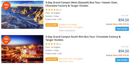
Want your visitors to click on a specific button? Then you need to make it stand out, and you can achieve that by using attention-grabbing colors. Even if your website designer has gone for a uniform aesthetical approach, when visually optimizing the platform, you should consider opting for vibrant shades when it comes to important page buttons. Pay attention to their size and placement as well. An example here is Tours4fun.com, a website that provides discount tours and travel offers. The site has optimized conversion rates effectively by using the same color for both the price of their offers and their “view details” button. The reason behind this decision is the main interest of customers to find the lowest price when browsing a discount travel site. Because it’s a similar color, the user is more likely to tap on the button.
Source: Huffingtonpost.com
Give this technique a try, when you are reassessing the layout of your site and its visual features.
Convert wishlists with discounts
The majority of ecommerce sites have a wishlist section available. Giving your visitors the possibility of keeping a tab of their favorites until deciding to actually purchase them is a great marketing tactic. However, not all customers who add something to their wishlist, end up buying the item. So how can you increase conversion rates here? An action with high potential is to provide your users with an exclusive wishlist discount. You will be reminding the customer of the products they “wish” to purchase and at the same time persuade them to complete the sale thanks to a personalized deal. A reminder email together with the mentioned discount can work effectively in increasing sales. Chairish is one example of online store that encourages its visitors to make add their favorite to a wish list, and then proceeds to send reminders via email, when the user’s favorite items go on a sale. This has helped the shop increase revenue and following its example can do the same for you. Converting your customer’s wishlist items into sales will give the user a sense of exclusivity. An idle item can turn into a purchase if you:
- Encourage new users to create a wishlist on your site
- Send occasional reminders on favorite products via email
- Add discount codes for the said items
Update checkout process
Your checkout process should never be unconventional, too long, or complicated, otherwise, you are likely to lose customers just as they are ready to complete their order. You can avoid checkout abandonment by ensuring your customers of the following things:
- Cost transparency
Focus on providing full cost transparency right at the cart level, so buyers can get an idea on how much they have to pay when reaching the final step of the process. From shipping charges to items price, list every expense detail of their order.
- Checkout process visibility
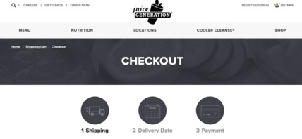
Work with visuals to show buyers where they are in the process. Orienting them from the start through visual cues will ensure them of a short process, and reduce the risk of car abandonment.
Source: Huffingtonpost.com
To conclude, you have multiple possibilities in terms of obtaining a conversation rate boost. Making your e-commerce business more successful depends on your strategically actions on the matter, so you are advised to look into each one of these suggestions with attention and care. Obtaining the results you desire, and skyrocketing your conversion rates could be easier than you have thought, if you use the right techniques to your advantages – start off with these few ideas.


