But web pages tend to go bad over time due to deleted content, moved content, or change in permalink structure. So the user experience that your visitor expects from your website is affected and increases website bounce rate. When they click on the link, they get a 404 page error popup indicating that the requested page is not found, instead of a landing page they want. This one error will damage all your hard work. Visitors will hit the back button in the browser and search for other websites that will solve their problems.
So to avoid the loss of leads and visitors due to outdated or permanently moved pages, you can customize your 404 page. A well-customized 404 page gives you a new opportunity to increase the conversion rate. Follow these useful tips to optimize a 404 error page for better conversion.
1. Human touch
Everybody can make a mistake, but what matters more is how you communicate it. Putting a human touch on the 404 error page will make the visitors a little more understanding and forgiving for the error. Sometimes the 404 error page is the visitor’s first impression of your website. There is no better way to engage the user than by putting a human face along with a name and what you do in the business. By adding a little information about you and your business will distract users from the initial problem and hold their attention. But don’t use stock photos. Try to use the face of someone in your company.
One of the great examples of human touch in the 404 error page is that of Emailcenter UK. Emailcenter UK added some friendly faces in a quite enjoyable and fun way. Adding such personality may hold the user’s attention and reduce the bounce rate.
2. Avoid technical language
According to Piyush Jain, Founder of Simpalm, a web design company in DC, “to increase user engagement through your 404 error page, you need to replace technical language with human language. Users only want to visit their required destination page. They are not looking for details on HTTP or some technical issues. Technical terms used on error pages make users frustrated. The error message can be something easily understandable by all the users”. Some simple possible terms are:
- The page may have moved
- Page is not available.
- The page may no longer exist
- Oops! This link isn’t working.
- Oh dear, something is wrong.
3. Apologize for the error
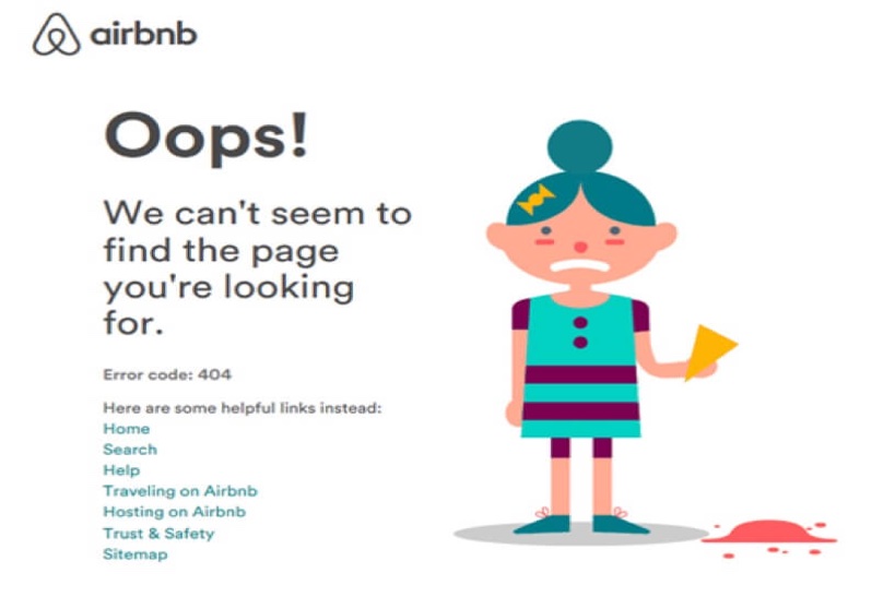
Your visitor is annoyed because they are not where they wanted to be; this will affect your website experience. You can turn this negative experience by taking the blame on you, even if it isn’t your fault. The user will appreciate that if you are sorry and accept that it’s your fault and apologize for that. By giving a simple explanation of why the page is not working rather than a cold error message, show how much users are important to you.
Airbnb does it very well and shows how much they care for their visitors.
4. Display possible solutions to their problems
Providing all possible solutions on the 404 error page is a vital method of optimizing its conversion rate. Once users understand the issue, it is time to provide them all possible solutions so that they can move toward the content they are looking for. You can display different navigation options on your 404 error page that can be followed by the users to get the information they are looking for.
- Search bar: According to Oren Greenberg, Digital marketing consultant, “the search bar option is the easiest and the quickest way to help your users to find what they are looking for. They can search through your content what they want instead of automatically forcing something that they don’t like”.
- Popular posts: You can also display your most popular posts that are already performing well on your 404 error page. If the visitor is landing on a 404 page, there might be a good chance that they want to visit one of your high performing posts.
- Popular products: It is the best way to increase the conversion rate. You can place your most searched or popular products on your 404 error page, which will gain the user’s attention towards your products and increase the conversion rate.
- Contact information: Allow your visitor to directly communicate with you this shows that you are there to help them and want to work together to solve the issue.
5. Create opportunity for conversion
One of the most common goals of customizing 404 error pages is to increase the conversion. You can embed the introductory video of your services, a link to the latest post, and a signup form. If you need more details than an email address and phone number then you put the whole form on the next page to avoid resistance. Another effective way to improve your conversion rate through 404 pages is to offer incentives like voucher codes or discounts to stay on site. You can also use exit pops to create opportunities for conversion on your 404 pages.


